
New Old Wine World Identity
Client
New Old Wine World
About
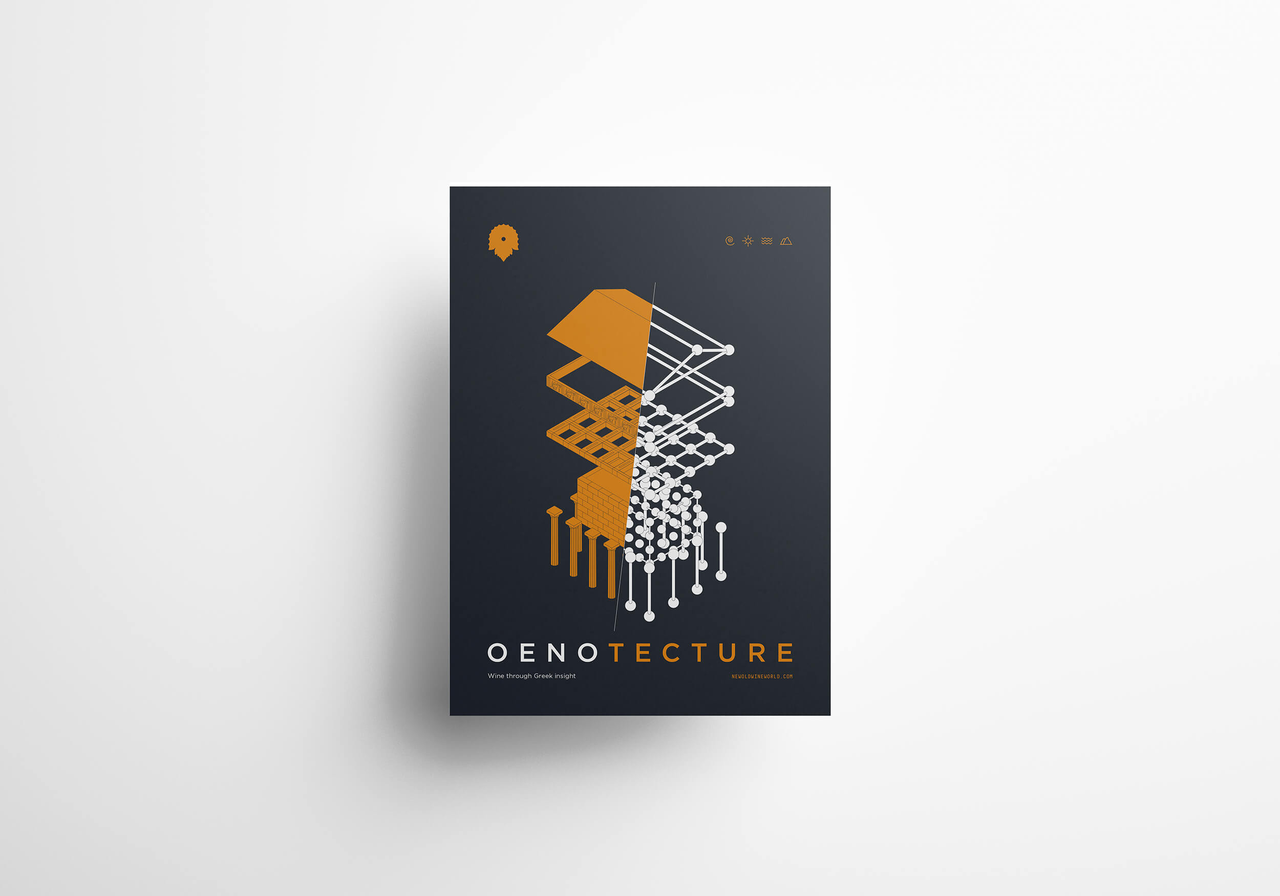
The fusion of wine-making and architecture. Τwo complex sciences joined powers to connect the past with the future of wine in Greece. A duality with a purpose, to guide us on a journey through traditions, craftmanship, landmarks and people.
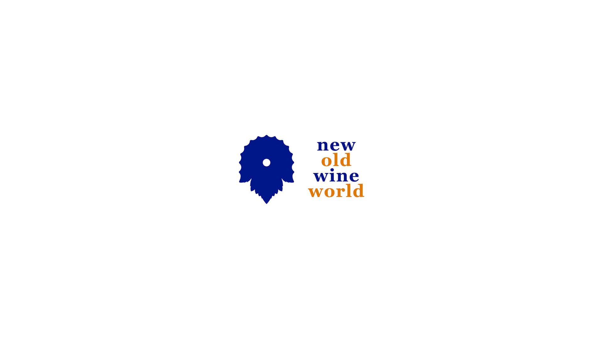
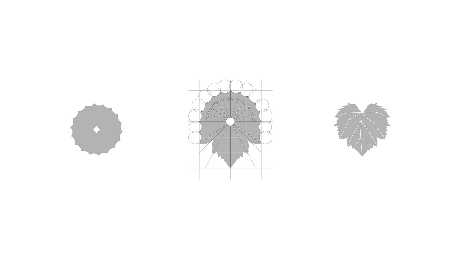
A top view section of a column transforms into a vine leaf. The combination forms a symbol which balances the applied with the organic, creating a metaphor of the primal fusion.
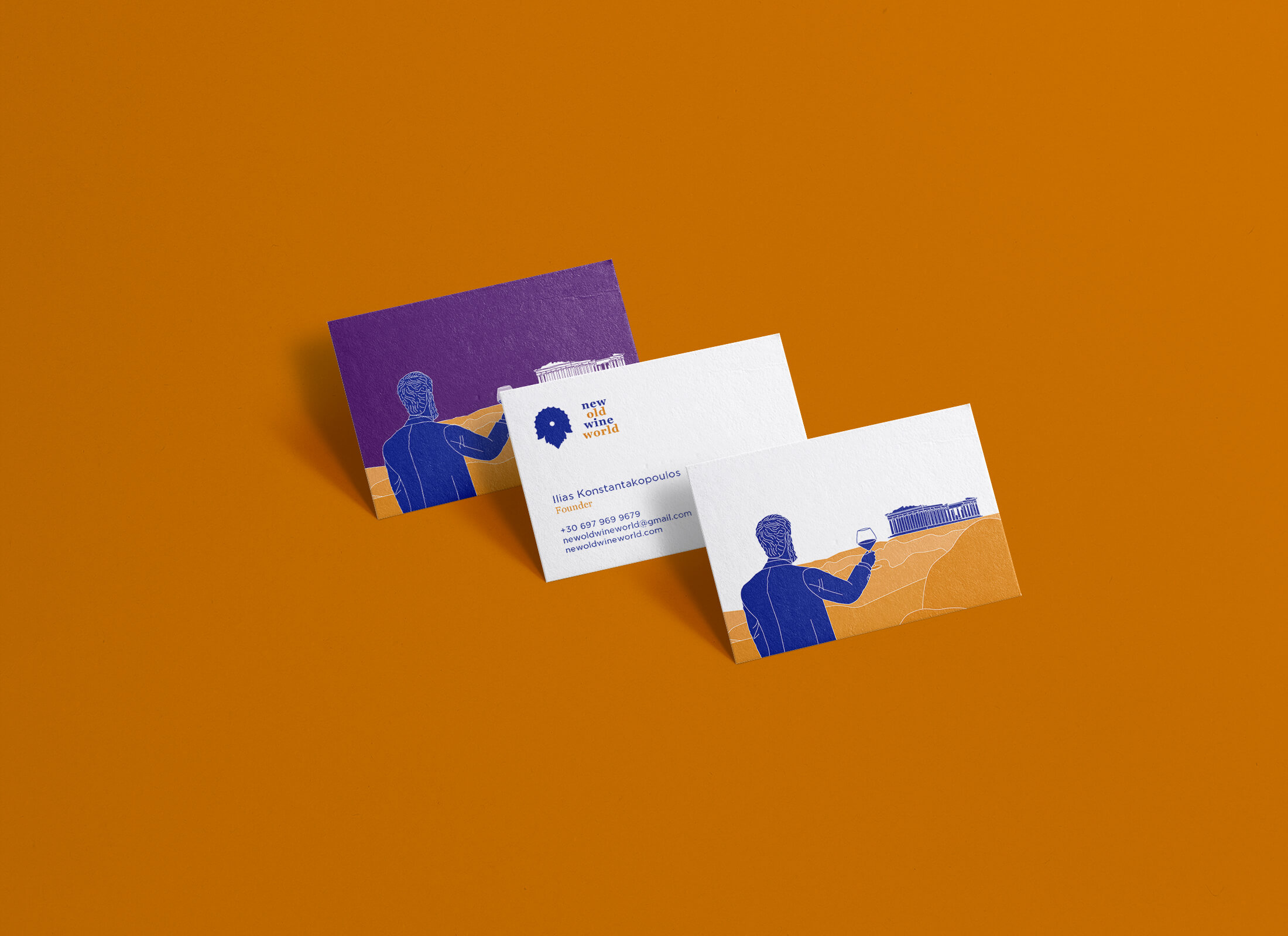
For the wording a contrast has been created. Georgia, a serif font commonly used on wine labels, utilized without capital letters. Another medium for creating a bridge between the present and the past. A novelty deriving straight from tradition.
The dual coloring is used for the second reading of the phrase: new wine, old world, which can also act as an indirect strapline.
To balance the organicity of the symbol, the shape of the center-aligned typography creates a negative form, in a way to complete the transition from the symbol to the wording.
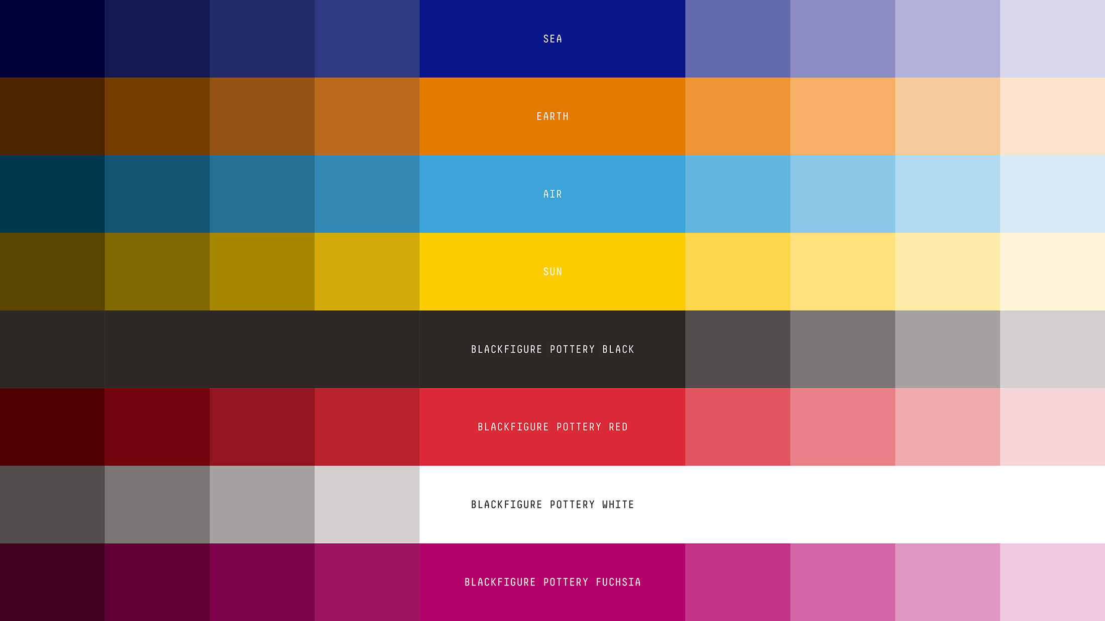
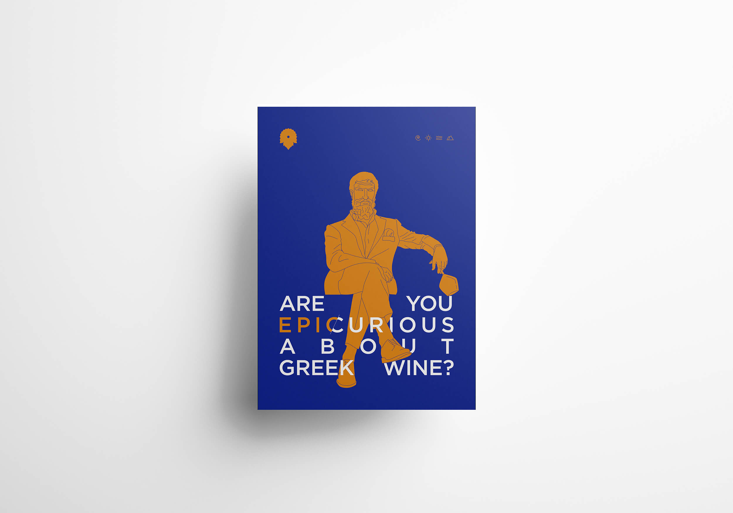
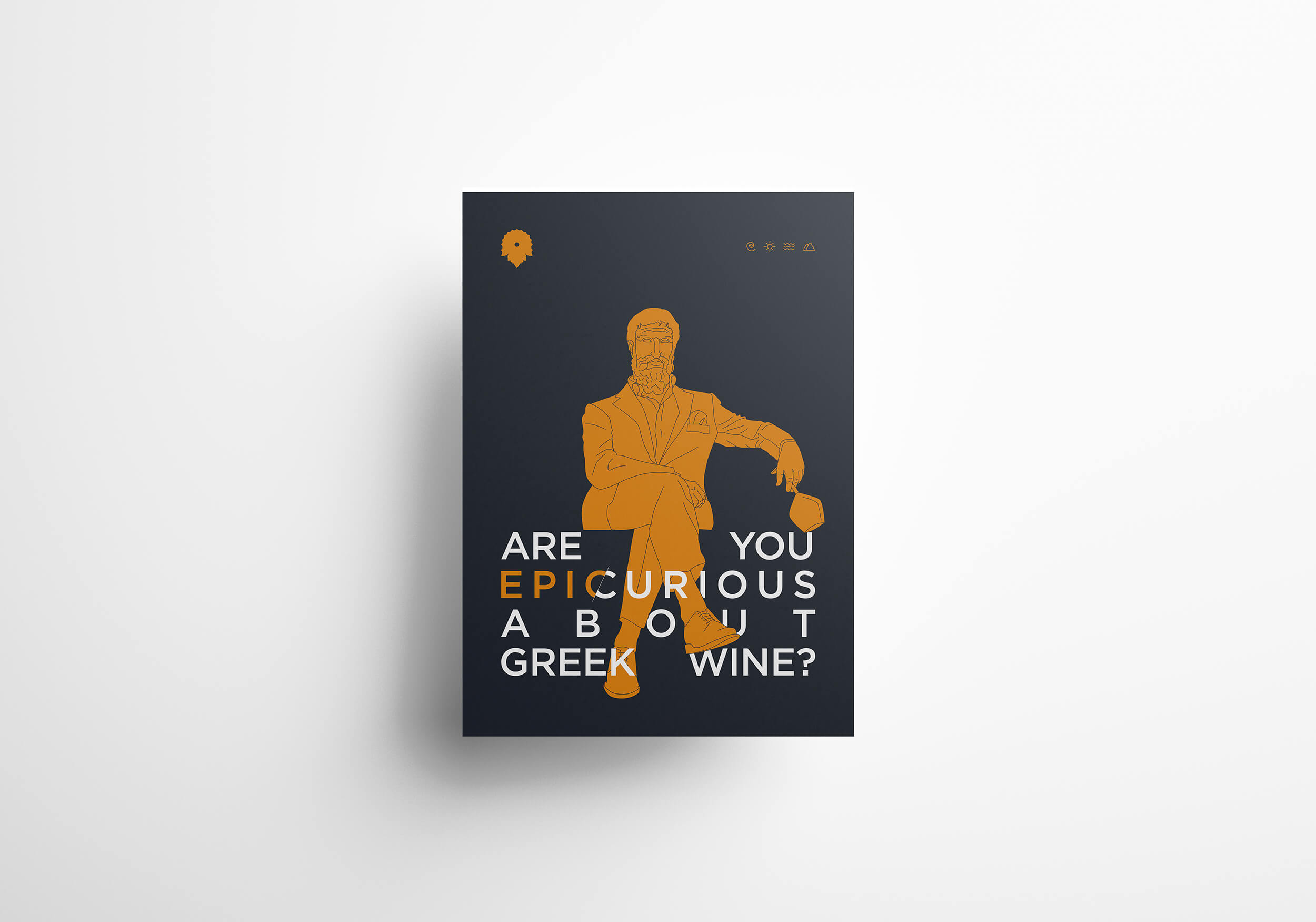
Utilizing iconic techniques, we created a visual language that combines black and red figure illustrations. Techniques based on traditional Greek pottery, the chosen ambassador for the identity’s visual communication.
Pottery was the medium for wine. Amphorae and wineskins for storing, large kraters for mixing with herbs or water, jugs and stemmed cups for sharing. All hand drawn with instances of daily routines, Gods, heroes, battles, a detailed visual manuscript, describing the transition from the past to the future.
A true cultural transformer.


