

Pino di Loto identity
Client
Pino di Loto, Boutique B&B
Developed by
Yorgos Melampianakis
The brief
Everything started with the pine tree, hence the name "Pino di Loto", about a century ago! The memories that carved the family's character, transformed the pine tree into a symbol. A home, away from home experience, creates the space where anyone can build his own happy memories.
In 2017, Pino di Loto celebrated its 10th anniversary. The celebrations signaled the expansion of the B&B with two further executive suites and also indicated the need of a new logo, that would illustrate the transition to a new era. The task was simple: create a brand identity, showcasing the hospitality and warmth, delivered to every customer, keeping the pine tree as the hero.
About
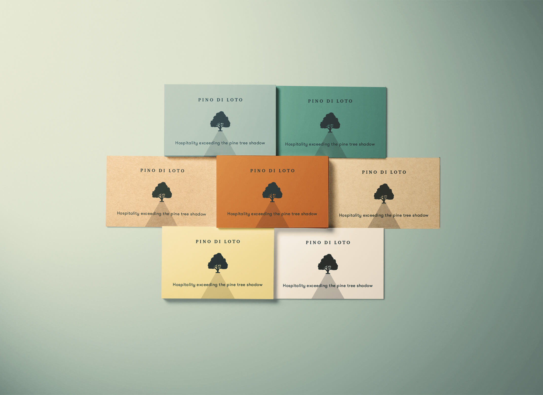
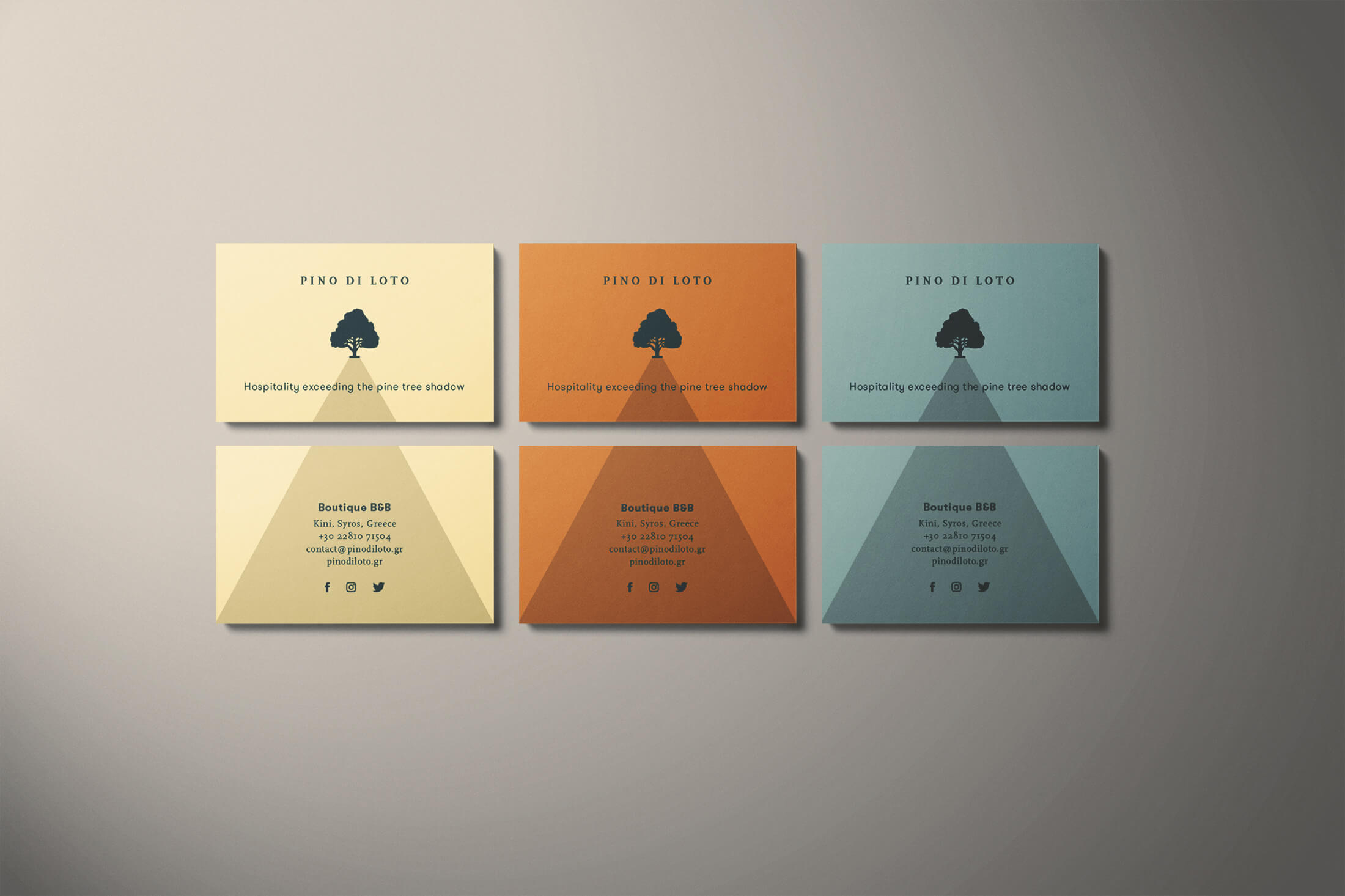
We created a logo, that has both organic and symmetric characteristics. Based on simple forms, we tried to communicate the values connected to Pino di Loto in a visual manner. The canopy is an abstract triangle roof that provides hospitality and security. The six branches are symbolising the rooms of Pino di Loto and the bracket ending adds quality and a strong base to the final symbol/glyph.
To enhance the identity, we developed a mechanism, to simulate the tree's shadow, adding to the sense of warmth, security and constant evolution. The mechanism is adaptable to any layout, either static or dynamic, reminding to the viewer that everything started with the pine tree.
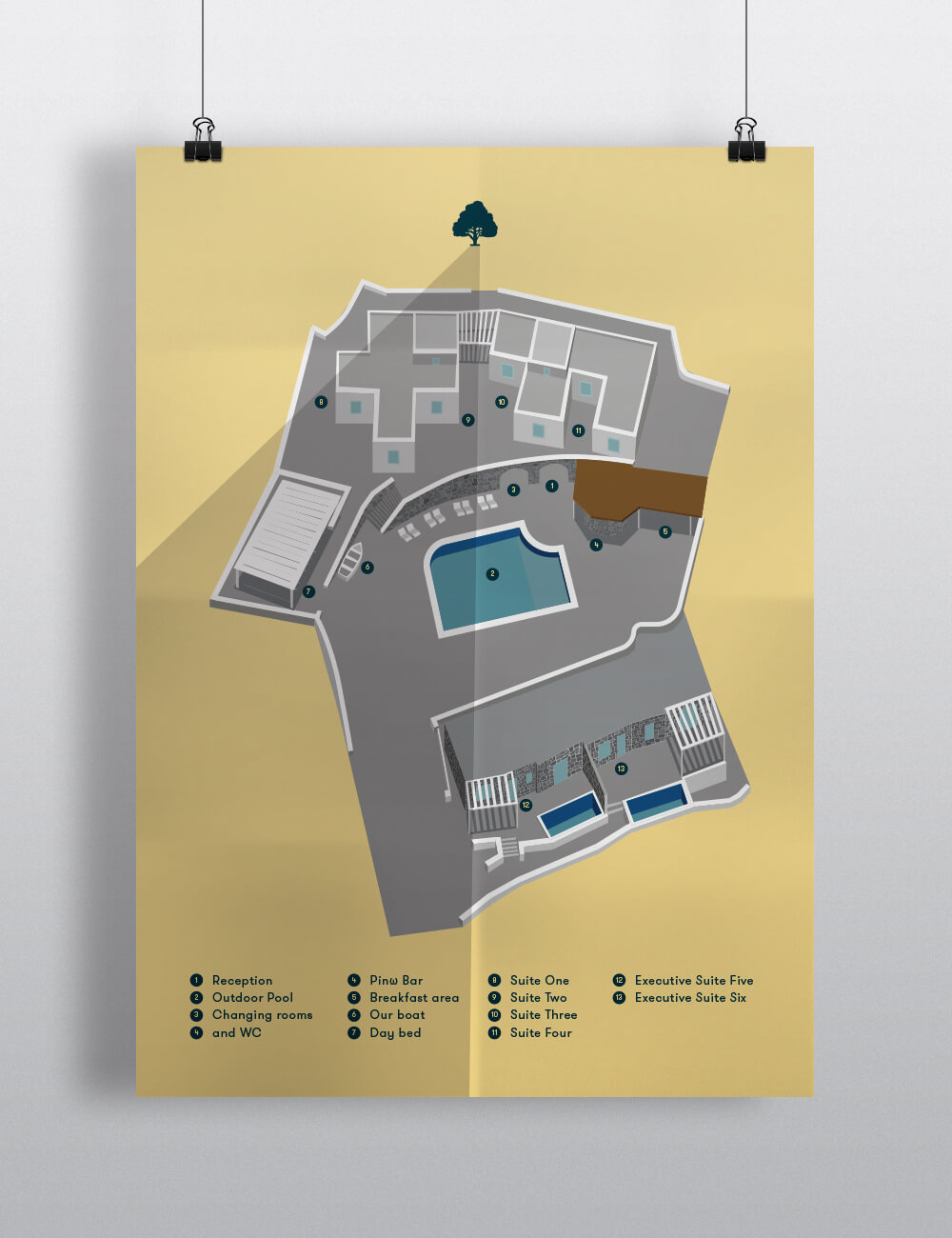
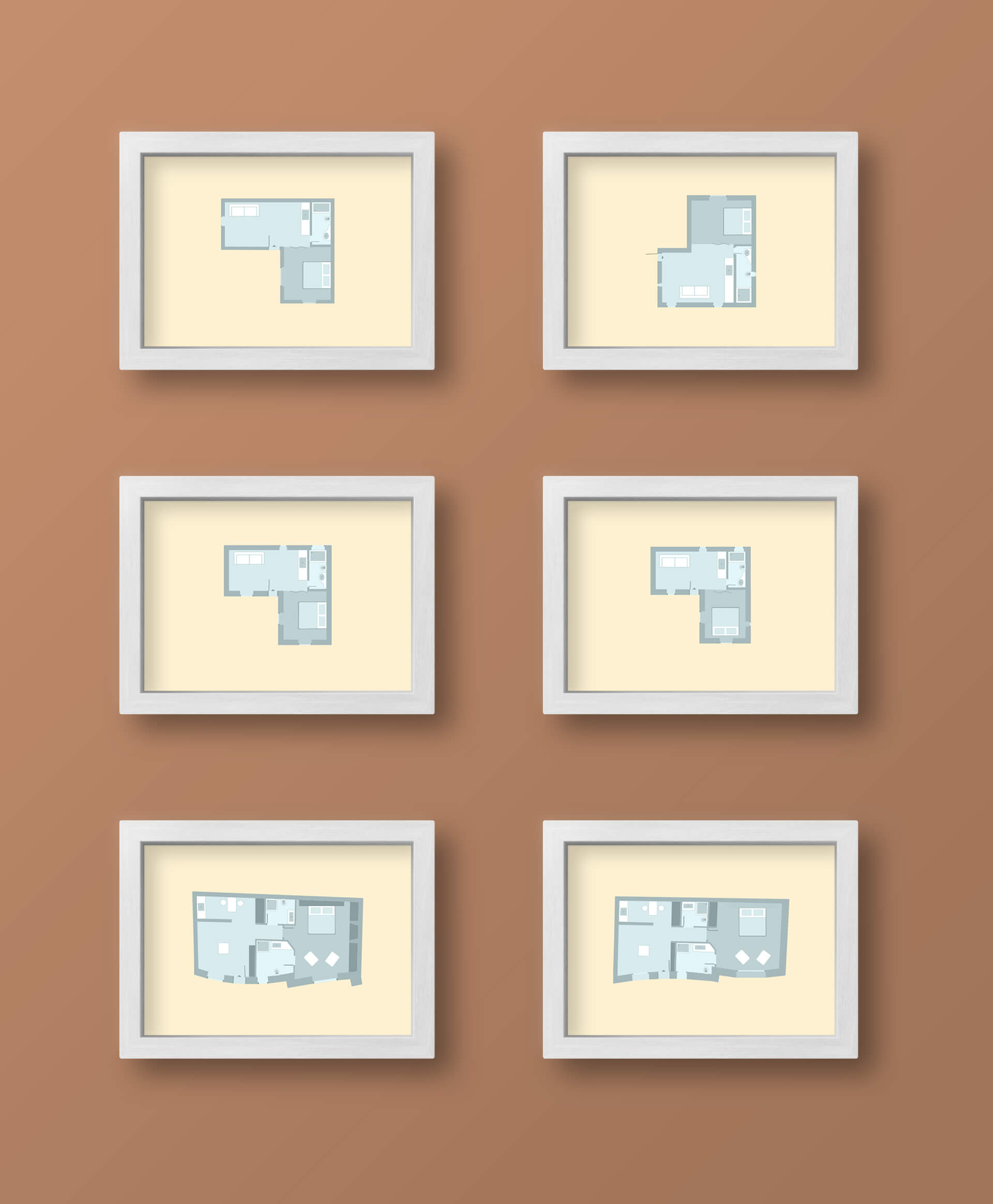
The use of a colored papers on the stationery, simulates the suites' interiors. All suites share a similar floor-plan, but each suite delivers a unique visual experience, because of the different materials, colors and textures used.


